Disclaimer: Views in this blog do not promote, and are not directly connected to any L&G product or service. Views are from a range of L&G investment professionals, may be specific to an author’s particular investment region or desk, and do not necessarily reflect the views of L&G. For investment professionals only.
Equity valuations uncovered (part 5): Beyond extremes
Do valuations only matter in extremes? And can the precise form of the valuation metric lead to different conclusions?

Radical ratios
A common refrain is that equity valuations only matter when they reach extreme levels[1]. At first blush, this makes some sense – the signals from valuation metrics are most dramatic when the market is either clearly cheap or outrageously expensive. But before we ignore the ‘middle of the road,’ it’s worth asking whether the potentially predictive power of these metrics is confined to extremes.
In previous blogs, I investigated the sensitivity, or ‘beta,’ of expected returns to starting valuation yields. We saw evidence of a positive relationship, even after correcting for biases. The question here, though, is whether this sensitivity is concentrated only at the fringes. To explore, I removed the extreme valuation observations from the dataset and re-examined the relationship:
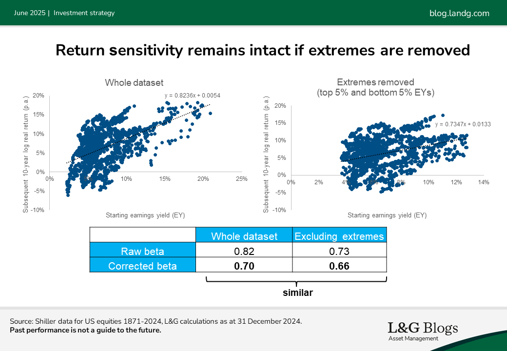
The results were interesting: as you can see, the beta for 10-year returns remained almost as large (and still rounded to 0.7) even when the extremes were excluded. This suggests that while extreme valuations deliver the loudest signal, the information contained in more moderate valuations still provides meaningful guidance for understanding expected returns.
In other words, although valuations matter most in extremes (and that is when the ‘hit rate’ of forecasts based on them is likely to be best), they don’t appear to matter disproportionately.
Metrics matter
While the influence of valuations isn’t limited to the fringes, this doesn’t mean to say that expected returns are a neat, linear function of valuation yields.
As you might have guessed the historical data is far too noisy and limited to reveal the precise form of the ‘true’ underlying relationship. That said, the implications of using different valuation measures are worth exploring. Three common formulations of earnings[2] (E) versus prices (P) are:
- Earnings yield (E/P): This is the straightforward measure of earnings divided by price that has been our go-to metric to date. It’s intuitive and meshes well with basic structural models[3].
- Price-to-earnings ratio (P/E): This is the inverse of the earnings yield and is a common way to describe how expensive stocks are. When plotting realised returns against starting P/E ratios, the relationship slopes downwards rather than upwards.
- Logarithm of the earnings yield (log(E/P)): Some academics prefer this formulation because it treats earnings and prices more symmetrically, since log(E/P) = log(E) - log(P), equivalent to -log(P/E). It is also a less skewed metric. The downside is that it’s less intuitive and harder to explain to a broader audience.
For each of these I constructed a corresponding model assuming a linear relationship between the chosen metric and subsequent returns[4] and fitted it to historical data. The graph below shows the results from each model, plotted against the earnings yield.
The first model appears as the straight blue line, whereas the regressions using the alternative formulations are represented by the curved grey and orange lines. Note the grey and orange lines would be straight had they been plotted against P/E or log(E/P) but are curved here because they’re plotted against E/P.
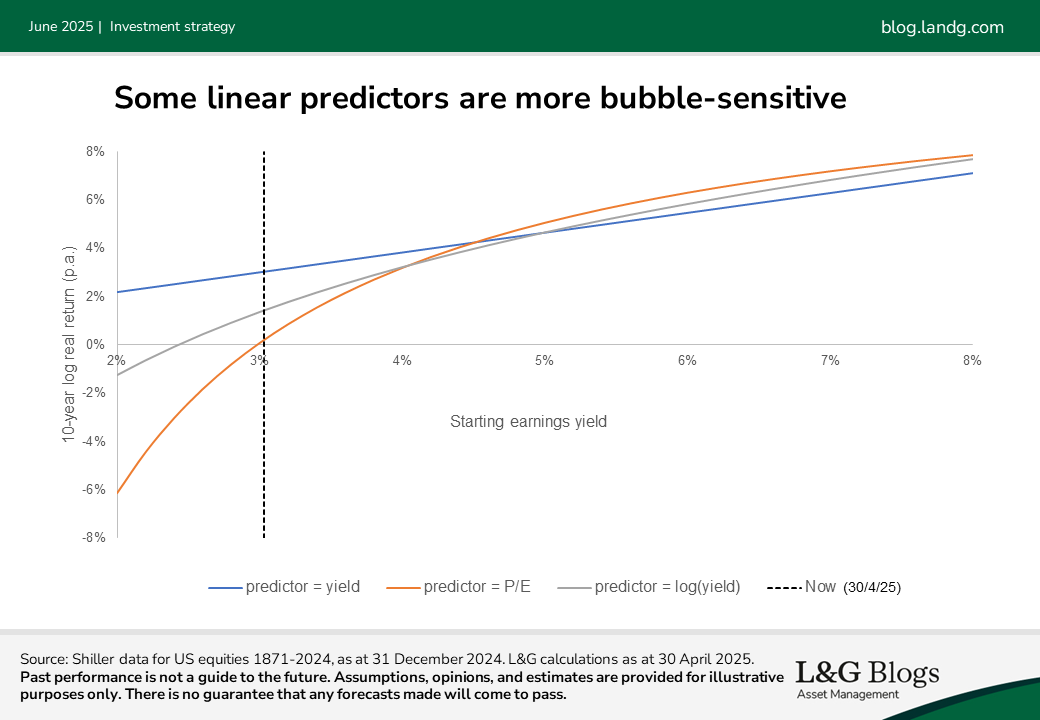
At cheap valuations (to the right), the difference in models is relatively minor but when valuations become lofty (to the left), the models diverge substantially. Out of the three, the P/E ratio is most sensitive to bubble-like conditions. This makes sense, given that as earnings shrink the earnings yield heads towards zero while the P/E ratio can, in principle, run off to infinity.
We don’t know which of these three measures is most accurate when in bubble territory, but we do know they paint substantially different pictures. While it’s possible P/E overstates the risk in bubbles, it’s also quite plausible that using E/P understates the risk.
There are, of course, trade-offs. We tend to use the earnings yield, given it is easy to interpret and communicate and ties in well with structural models. But the important caveat is that it could be too kind to the outlook for equities during rich valuations.
Onward in value
This is the fifth and final blog of the ‘equity valuations uncovered’ series – I hope you found the series interesting and useful! This doesn’t represent the end of our research, however. There is plenty more going on, including extending some of this research to other asset classes. Please stay tuned for further insights.
[1] This is more a market aphorism than a direct quote from a well-known academic or investor.
[2] Cyclically-adjusted. One can also look at dividends.
[3] Such as the earnings yield is the real yield
[4] The line of best fit was found via a combination of a regression and corrections for finite-sample bias.


Recommended content for you
Learn more about our business
We are one of the world's largest asset managers, with capabilities across asset classes to meet our clients' objectives and a longstanding commitment to responsible investing.