Disclaimer: Views in this blog do not promote, and are not directly connected to any L&G product or service. Views are from a range of L&G investment professionals, may be specific to an author’s particular investment region or desk, and do not necessarily reflect the views of L&G. For investment professionals only.
Equity valuations uncovered (part 2): Valuation regressions – handle with care
What are the pitfalls of regressing equity returns against starting valuations, how can we correct for them and what is the upshot for expected returns?

We imagine many readers will be familiar with scatter plots such as that shown below, which shows historical 10-year real returns plotted against their starting earnings yields.
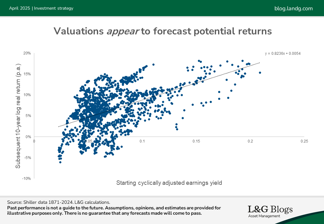
Such plots undoubtedly contain useful information but interpreting them correctly, or using them to set expected returns, is a minefield. There are three main pitfalls in our view:
1. Overlapping data: The chart is based on monthly data but plots 10-year historical returns. Due to overlapping periods, such charts can give the impression that the historical relationship is supported by a large volume of data, when in fact there are relatively few independent observations[1].
2. Predicting the past: The black line-of-best-fit shown can be described as ‘predicting the past’. This can be a problem because what counts as cheap or expensive changes through time. For example, back in 1995 the cyclically adjusted earnings yield for US equities was about 5%. At the time that looked expensive relative to history, so might have been used to forecast low returns. But fast forward to today and such an earnings yield looks distinctly average.
3. Finite-sample bias: A more subtle – and widely underappreciated – issue with these plots that I explained in a blog last year is a ‘finite-sample bias’[2]. This is in some ways potentially even more concerning than the two issues above given that it can cause investors to systematically misjudge the sensitivity of expected returns to starting valuations. As such, dealing with this bias is the focus of this blog[3].
Finite-sample bias
Under normal conditions, linear regressions – even if using overlapping data – are unbiased. This means that although the fit may well be noisy, they’re correct on average.
However, those ‘normal conditions’ often don’t apply when attempting to forecast returns. A bias arises if you regress a quantity based on its lag, or a proxy for it such as valuation yields.
To understand the bias and why the volume of data matters, consider a point towards the right of a scatter plot (such as the one above) where the yield was high relative to history. This relatively high yield has likely arisen due to relatively low past equity returns. But, as there is only a finite pool of data, this leaves above average future returns in the rest of the sample – which then get plotted against those high starting yields. This can lead to an artificial relationship between high starting yields and strong subsequent relative performance.
The concept and its mechanics can be tricky to grasp, but the blog illustrated how scatter plots similar to history can be created by a process where returns were unpredictable by construction. However, as I stressed at the time, we need to be careful not to jump to the conclusion that valuations are useless. I used a crude model for earnings yields and returns in the blog to illustrate the effect, but more careful analysis is needed to gauge the genuine role of valuations.
Correcting for bias
Highlighting this bias is one thing, but how do we adjust for it? One approach is to use simulations. However, in the case of equity returns thankfully there is a shortcut – a formula is available[4].
I applied the correction formula to the Shiller data using dividend yields or cyclically adjusted earnings yields as the predictor. The charts below show the results across different forecast horizons.
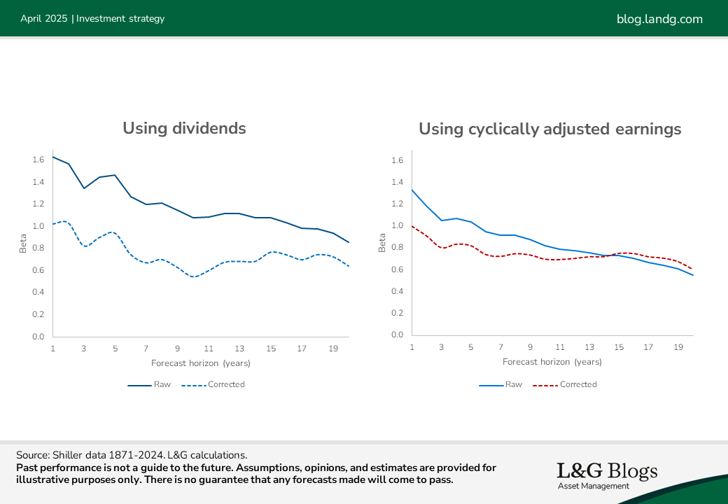
The ‘betas’ represent the sensitivity of annualised expected returns over the forecast horizon to the starting yield level. If this number is 0.8, for example, then annualised expected returns change by 0.8% (on average) for every 1.0% change in yield. The ‘raw’ betas are what the historical scatter plots suggest, whereas the ‘corrected’ betas strip out the bias.
The biases, represented by the gaps between solid and dotted lines, are larger when we use dividends[5]. But post-correction betas using dividends or cyclically adjusted earnings are broadly similar. They start around 1.0 and then gradually drift downwards, to around 0.7 for 10-year forecasts.
The above used 150 years of data. But it’s not uncommon to see plots based on as little as 25 years of data, which can generate much larger biases.
Valuations matter
The most important takeaway from the above chart is that the corrected betas remain positive. Unfortunately, though, their statistical significance isn’t high, even with c.150 years of data at our disposal. It varies with the setup but typically we might still observe data consistent with history (or stronger) with about 20% probability.
That doesn’t sound great but in a 2006 paper 'The dog that did not bark: a defence of return predictability’, American economist John Cochrane made a clever observation. He noted that high prices (low dividend yields) ought to reflect lower expected returns, or higher expectations of future dividend growth. But empirically there’s no evidence (the silent dog) that dividend growth is forecastable. Using this argument, he established much stronger statistical significance.
Beyond a static risk premium
Even if you don’t buy Cochrane’s argument, an important point is that just because you can’t confidently reject a null hypothesis (here that valuations don’t help forecast returns), this does not mean to say that hypothesis is true. It might even be an ‘inappropriate null’. Even if you believe markets are completely efficient, valuation-sensitive expected returns are compatible with that assumption. Fluctuating risk premia can reflect shifts in aggregate risk appetite, for example, and don’t imply a free lunch.
Another aspect to bear in mind, that we will return to in future blogs, is that investors should also pay attention to changes in risk when deciding how to allocate dynamically. As an analogy, few would claim that the expected excess return on credit has nothing to do with its spread, but that doesn’t mean generating higher risk-adjusted returns by moving in and out of it is a piece of cake.
As you can tell, allowing for statistical quirks is no easy matter! However, the upshot of our analysis is that valuations remain an important aspect to pay attention to when illustrating expected returns.
Stay tuned for my next blog when I’ll dive deeper into the importance of the forecast horizon.
Past performance is not a guide to the future. Assumptions, opinions, and estimates are provided for illustrative purposes only. There is no guarantee that any forecasts made will come to pass.
[1] The longer the forecast horizon relative to the dataset size, the more pronounced the illusion can be. Note that overlapping data leads to the correlation being overstated, but doesn’t cause bias in the regression coefficients.
[2] This applies even if everything is out-of-sample e.g. if you used the above as evidence for the structural model that the earnings yield is the real yield.
[3] In contrast, issues (1) and (2) do not lead to biases, even if they lead to lower statistical significance.
[4] Assuming a certain model for yields and investment returns. See Predictable Stock Returns: The Role of Small Sample Bias on JSTOR, pages 644 and 645. The method applies using log yields as the predictor, but I checked numerically that a very similar percentage haircut reduction applies for regular yields.
[5] This is because dividends are a smoother series than cyclically adjusted earnings and so the starting yield becomes a closer proxy for the lag of (inverted) price.


Recommended content for you
Learn more about our business
We are one of the world's largest asset managers, with capabilities across asset classes to meet our clients' objectives and a longstanding commitment to responsible investing.